
I’ve written a lot of posts that at least touch on lettering over the years, 53 according to the category menu on the right side of my blog page. Here’s the list. Of course, I’ve continued to learn with each project and situation, and I’ve discussed several different methods I’ve used. One way or another, this incised lettering comes down to simply cutting a v-section into the wood. I want to share a few more thoughts and re-emphasize some old ones, using a few recent projects to fuel my comments.
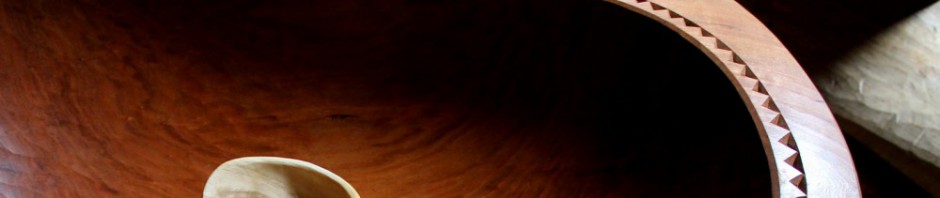
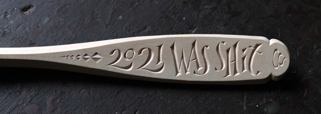
For small scale lettering on spoons, my pen knife blade does the trick. Although, even at that scale, if the wood is hard enough, like with the sugar maple (Acer saccharum) in the photo above, I’ll need to make a couple passes. I’m already doing that second pass on the central portion there, and the “2021” is waiting for expansion. Having a couple small gouges handy can help on the tighter curves.

In this butternut, which is much softer than maple, I was able to use the knife to cut the letters that are around 1 1/2 or 2 inches high.

Strop up before tackling the end grain.
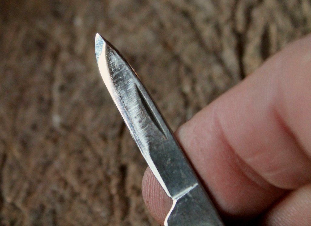
I like to use the pen blade of my pocket knife. I know very little of metallurgy, but my experience tells me that the high carbon steel blade takes a fine edge that isn’t brittle. It sharpens easily, and I make the angle of the edge much more acute than the factory grind. The forward portion has an edge angle of maybe 12, no more than 15, degrees. It’s hard to measure and I just go by feel on a very fine sharpening stone, barely raising the back side of the blade off the stone. I make fast little circles while manipulating the blade to catch the whole edge. I finish by stropping, and then strop again from time to time to maintain the edge.
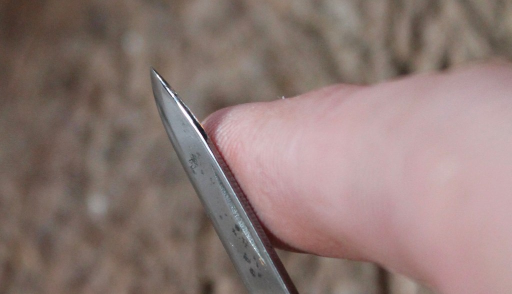
Also on the sharpening stone, I round the back corners of the blade, especially toward the front. This makes it easy on my finger and allows the blade to glide around curves more easily. I also ease the transition from the bevel to the side of the blade.
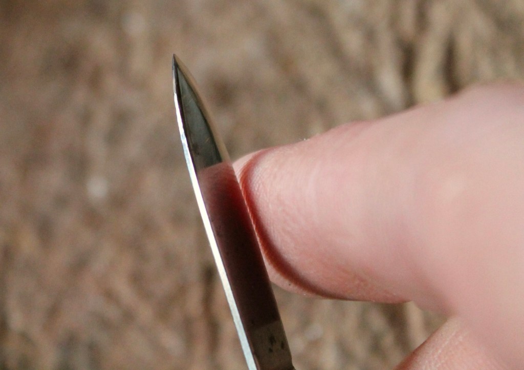
Here’s one final angle showing the opposite side of the blade. I sharpen it, symmetrically — or that’s the intent anyway.
I started using this blade because I was already carrying it in my pocket; it was handy. Now it is what I’ve gotten used to, so it works for me. Other knives with various blade styles may work just as well for other folks. It certainly doesn’t have to be a pocket knife. You can easily reshape a small blade on an existing fixed-blade carving knife. It’s only the front 1/2″ or so that’s vital. This post shows some photos of a blade I reshaped. It’s important to have a tool that will do the job well, but it is far more important to spend the time working with it to develop skill and a relationship with the tool. And you can cut letters with things other than knives.
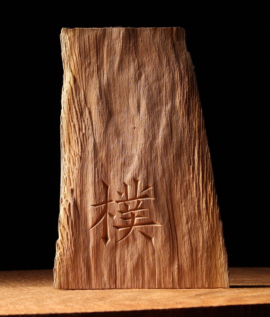
For example, I was asked by a friend to carve the Chinese character “pu” often translated as “uncarved block” or “unworked wood,” a concept central to Daoist philosophy. I’m certainly not one to explain it, but if you’re interested, Alan Watts discusses it here.
When it came to carving the character I quickly got out a couple carving chisels. I didn’t take photos, but with a straight chisel I cut down from opposite sides to form the valley. This is at the core of the method Chris Pye explains in his excellent book Lettercarving in Wood: A Practical Course. In recent years, it had only been available used, but as you’ll see at the link, it is now back in print. I can’t recommend it highly enough.

The chisels were suitable to carve into the dry hard cherry wood, and I still used the knife to clean up junctions and other areas, in combination with a skew chisel.

Still, a knife may have the advantage in many situations. Chisels should be held with two hands, leaving none to hold curvy sculptural pieces like spoons. And the hand with the knife and the hand with the spoon ideally act in concert with one another, moving simultaneously.

Lettering offers endless creative possibilities, and the message can be anything from a sublime line of classic poetry to a simple word or phrase. Whatever the case, it can mean something to someone. Above is a photo of the spoon I was working on in the first photo of the post.
The exact phrase was a specific request. Emily Dickinson it is not, but a friend’s direct and playful reflection, and fun for me.

If you want to carve letters, the important thing is to begin and keep going. You will learn subtle things with every project and your cuts will improve. Meanwhile, the early projects are no less meaningful. I know people get intimidated by the design of letters as well, and I hope to share some more thoughts on that subject too, but just try to have some fun with it. We’ve been making letters since we were little kids.
Today, I took the above photo of the handle of a cooking spoon we’ve been using in our kitchen daily since I carved it a dozen years ago. Kristin loves it.
PS: If you want a deeper dive, I’d also recommend the book Lettercarving in Stone by Tom Perkins, even if you don’t want to carve in stone. And, if you can resist being overwhelmed, two websites that have abundant lettering resources and inspiration are those of The Lettering Arts Trust and John Neal Books.

Xlent–Alan Watts, Psychotherapy East and West
LikeLike
You can explain it to me the next time I’m in Plymouth, Marie.
LikeLike
That little stylized turd at the end of the 2021 spoon is quite elegant.
LikeLike
Thanks for noticing, Kalia. It was carved for a classy Englishman. I guess it’s an English turd.
LikeLike
Well, I have just noticed the odd ‘Richard-the-Third’ at the end – well spotted!
I can’t help thinking that over here we sometimes add an inexplicable extra nuance to the word by adding an ‘e’ to the ending.
It’s a British thing!
LikeLiked by 1 person
Dave,
Thank you for the great resources resources. I like the chip detail on the “ Stay Awhile” spoon. An inviting and enjoyable saying.
LikeLike
Thanks, Skip. Yes, that was a fun chip design to carve. I keep coming back to the Stay Awhile since carving it the first time. This is, maybe, the fourth spoon with the phrase, but none with the same layout of the letters.
LikeLike
Excellent.
I’m glad that Chris Pye’s book is back in circulation.
I had an invaluable weekend’s tuition at Chris’s place near the Welsh borders about 30 years odd ago…… I recall that we spent all the first day going through sharpening. The most valuable woodwork day I have ever had. It was the middle of winter – ice everywhere and the other guy pulled out.
I hope that you can continue to explain your construction of fonts, which is always a problem for me!
All best from Wales
LikeLike
What a loss for that other guy. I envy your day with Chris. He is a brilliant carver and I’ve learned so much through what he has written and explained about carving. All of his books are treasures.
I’ll be working on the lettering design aspect. Thanks.
LikeLike
Well put, I would only add the most important step, an obvious one for most people other than I, is spell check. That has ruined many projects of mine 🙂 Its such a horrible feeling to finish a letter and think to yourself, that came out not bad, then to look closely at what you did and realize your mistake.
LikeLike
Amen. See my “Dr. Kutcha” sign in this post: https://davidffisher.com/2017/11/13/learning-from-lettering/
Your thought also relates to spacing; make sure all the letters will fit. Thus the little joke with the “A Beautiful Flop” sign. A friend’s experimental design with a musical instrument had failed, but it still looked lovely. He liked how another maker described it as “a beautiful flop” and wanted the phrase to be carved as a reminder.
LikeLike
I just received Martin Wenham’s book: The Art of Letter Carving in Wood. It’s excellent.
Thank you for your selfless generosity (is that a redundancy?)
Stanton
LikeLike
I’m replying even though I’m speechless. I had no idea Martin Wenham had written the book. His work and sensibility is incredible, and I linked to a video about his work in one of my earliest posts: https://davidffisher.com/2015/04/11/lettering/
Thank you! I’ve ordered a copy from Blackwell’s in England. Hopefully, it’ll be on a fast ship.
LikeLike
I ordered my copy from the same source. They said it would take 4 to 6 weeks for it to be delivered, but it arrived in 10 days (I live in Texas).
LikeLike
Pingback: Q-R-S-Tree-U-V | David Fisher, Carving Explorations