
I had wanted to carve an alphabet board for a long time, and I finally got around to it. The process began long before I took a knife to the basswood board above.
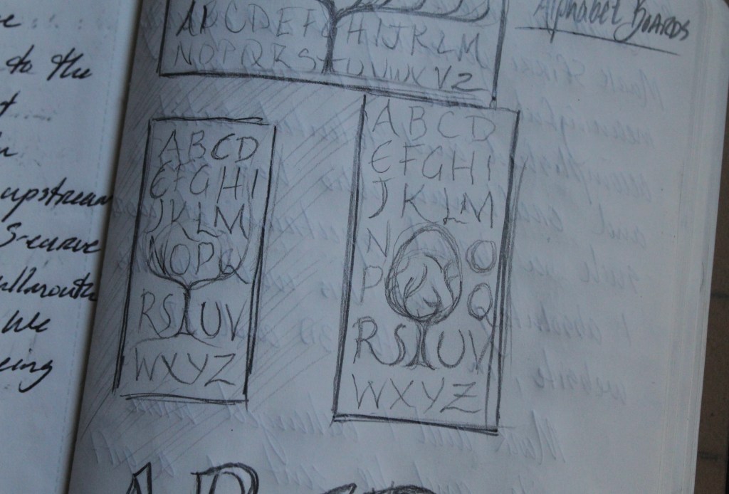
I first put my thoughts onto paper with this page in my notebook back in June. Just a few thumbnail sketches.

Eventually, I focused those ideas into a larger sketch, still pretty loose, but it also allowed me to envision some possibilities with some quick colored pencil work.
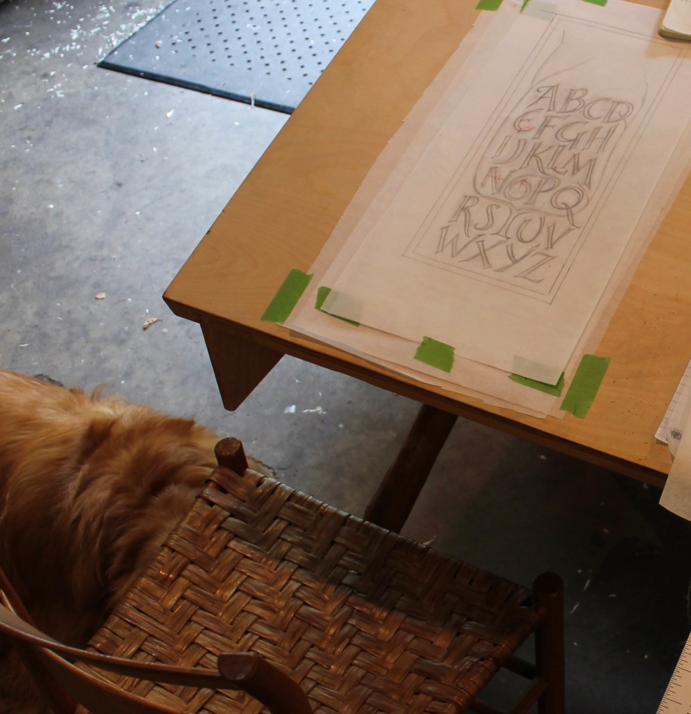
With thoughts of making several examples using this same design, I developed the design further by drawing it full size on tracing paper. By laying a sheet on top of earlier drafts, I was able to adjust the spacing and redo certain things as the design developed. This space-saving drawing board has served me well for a few years now. I have plans for it in this post. An angled drawing surface is a lot easier on your neck.
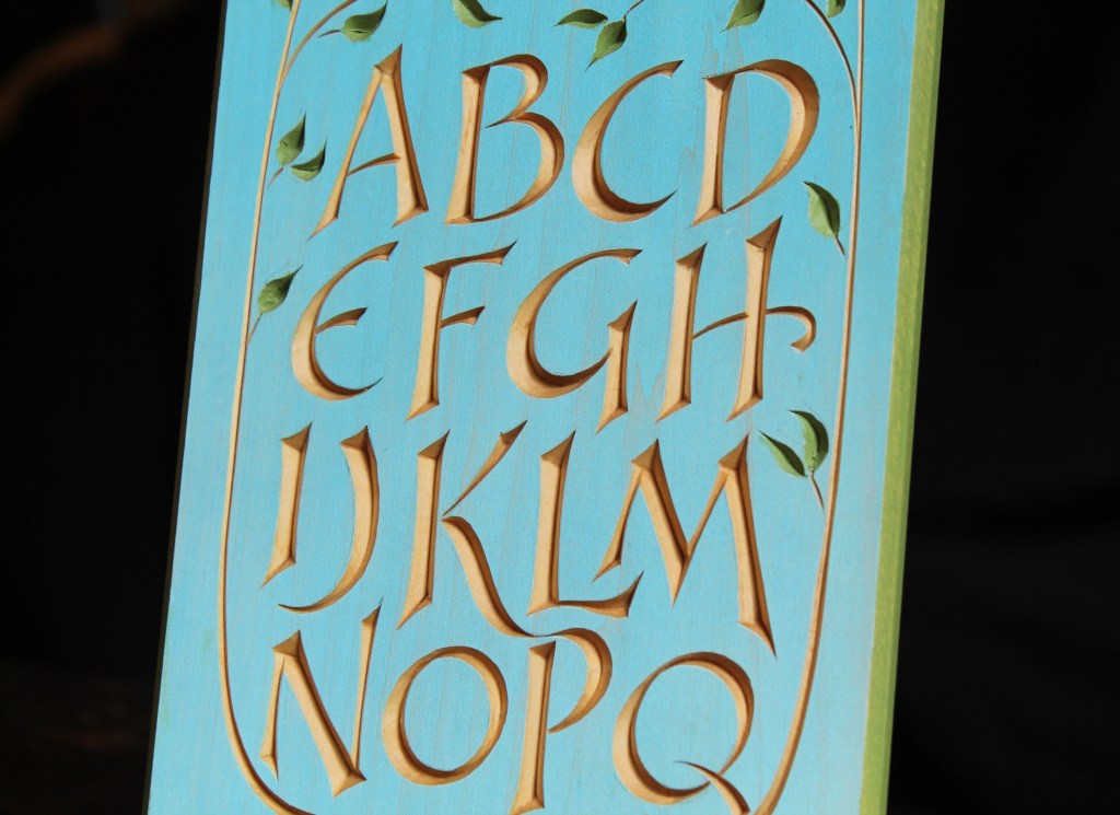
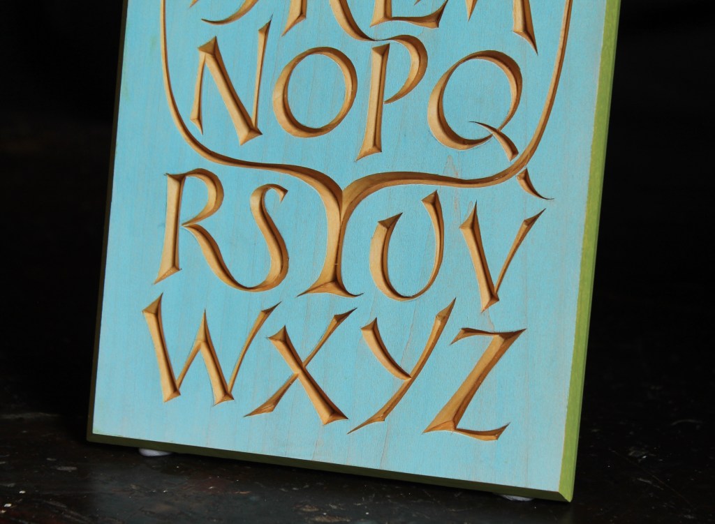
After hand planing the basswood board, I brushed on blue artist oil paint, then wiped most of it off of the surface, allowing the grain of the wood to peak through a bit. That took a few days to dry completely. I transferred the pattern with graphite paper, carved with a knife, then painted the leaves and border carefully.
I decided to keep this first example and make a second, in butternut.
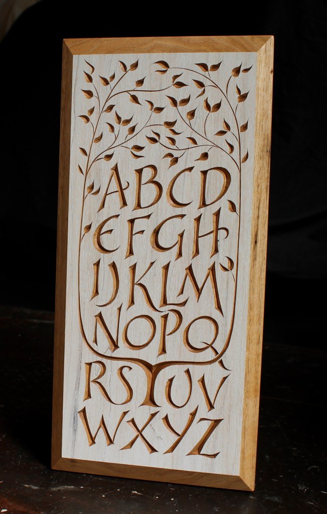
For the darker butternut, I decided to do a wash of titanium white over the surface. The contrast between the paint and the wood is a little more subtle than it appears in the photograph above.
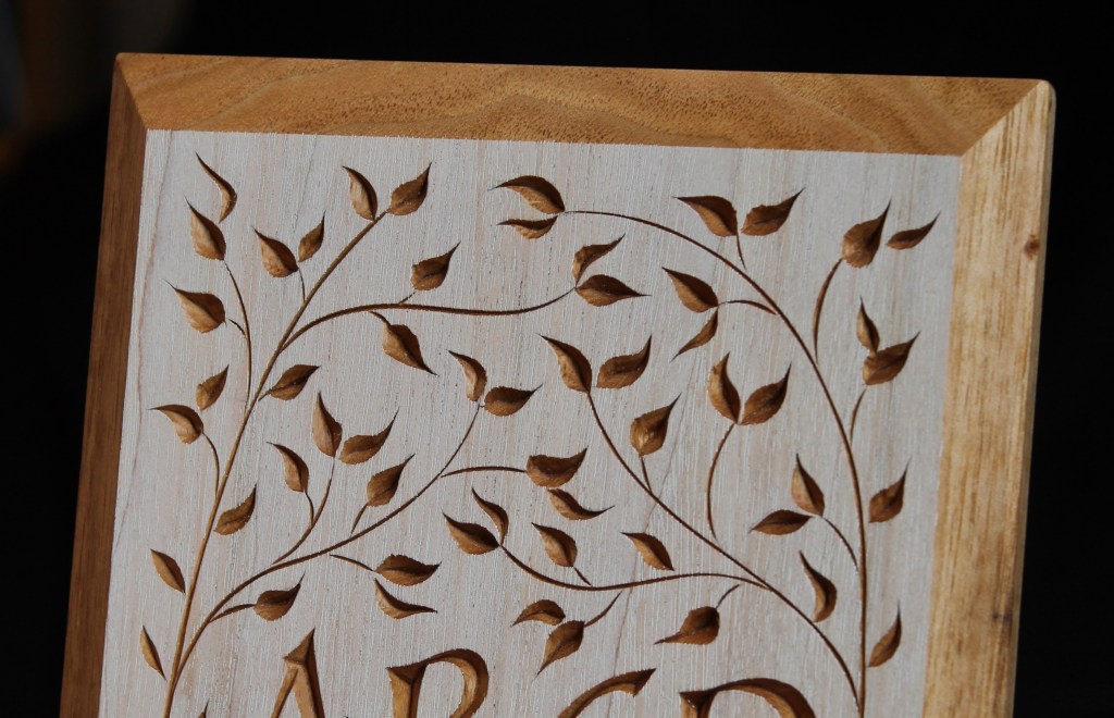
Care must be taken, when placing and carving the leaves, to avoid short grain situations between leaves that will split away under the pressure of the knife.
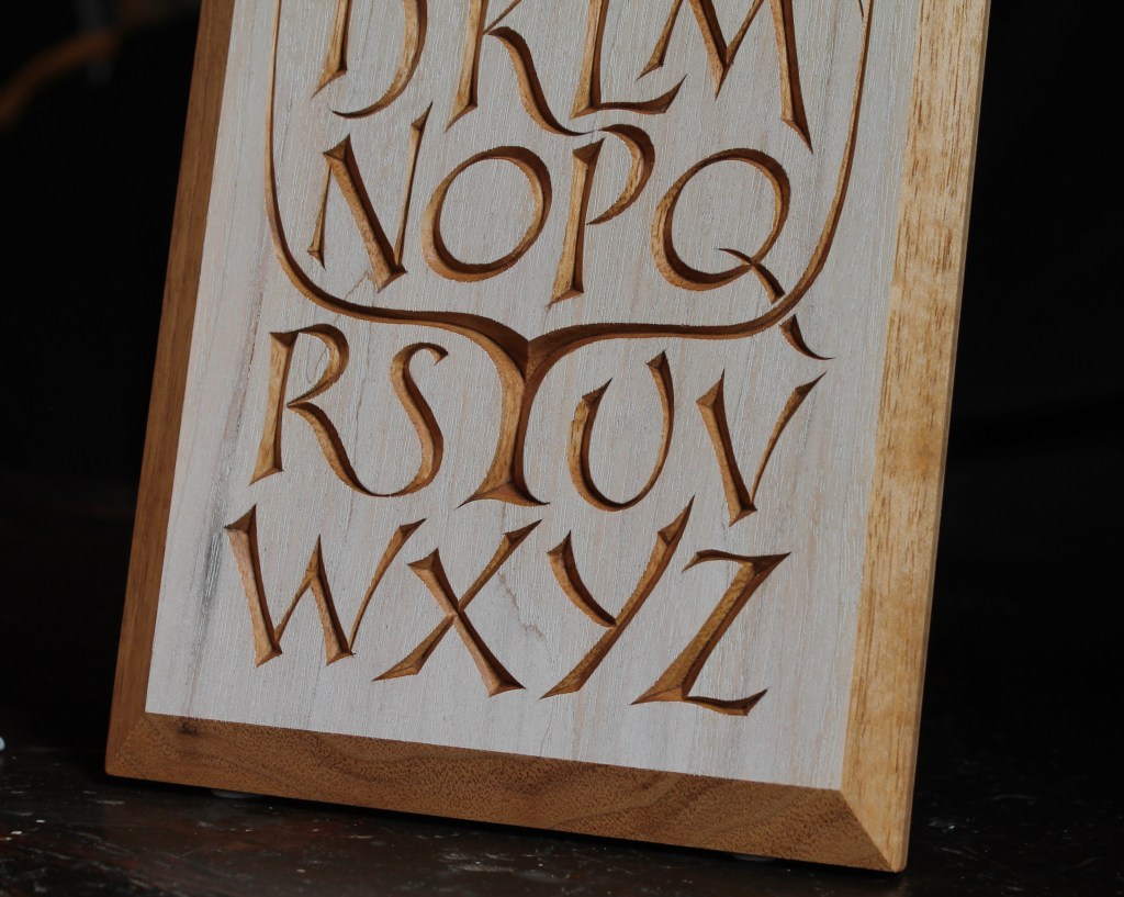
The border was created by planing a wide bevel after the carving was done. For the butternut version, I used a thicker board that allowed for a more substantial border.

that is just yummy–xlent
LikeLiked by 1 person
Your artistry and talent continue to amaze.
Thanks for creating such beauty, Dave.
LikeLiked by 1 person
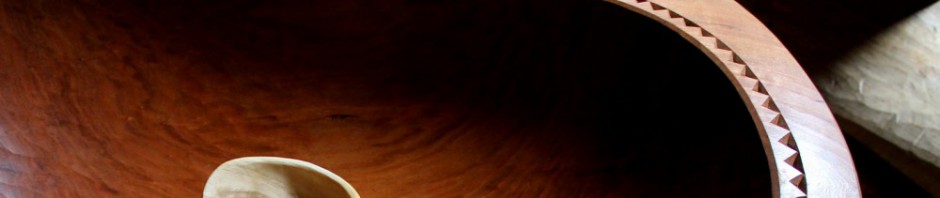
Not only super X-Y-Z boards, but image #4 shows part of an awesome chair.
Bob Simmons
Sent from Bob’s iPhone
>
LikeLiked by 1 person
Thanks, Bob. That’s my first Alexander chair. Very special to me.
LikeLiked by 1 person
Wish I had a fraction of your artistic eye (and hand)…
LikeLiked by 1 person
Thanks, Earl. I’ll bet you do have both.
LikeLike
Beautiful. Stunning. Wow. Oil paint can take a long time to dry, very long sometimes. Days, weeks, months perhaps even years to fully dry.
LikeLiked by 1 person
Thanks, Tony. It may take days or even a week, but that’s about the longest I’ve experienced in these thin coats. Those extremely long dry times are usually in the case of oil paintings in which the paint has been applied thickly. Also, on certain pieces, some time in the kiln at around 140 degrees or so can help the paint to dry faster.
LikeLike
Dave, in this pattern the letters seem to be slightly slanted upwards from left to right: is this something you achieve intuitively from experience or with the aid of some reference angles while sketching? I don’t know the first thing about drawing fonts, but to my eye the consistency of the slant is really impressive if it’s done by eye.
Those are two absolutely lovely pieces, carved with surgical precision. I don’t know if it’s true in person, but from the pictures sometimes it looks like the letters are carved, sometimes it looks like they are sticking out. Thanks for sharing.
LikeLike
That’s interesting, Marco. The stems are pretty much vertical with no slant, but there is a certain movement created by the way the curves and other elements of the letters have been drawn — I think! Anyway, I didn’t consider that specifically as I was drawing, and I didn’t use any reference angles or anything. I just drew, and redrew, them by eye. Like you, I don’t think I know the first thing about drawing fonts!
Also interesting about the illusion of the sidewalls of the letters sticking outward! Thanks for sharing that.
LikeLike
What a lovely way to begin this day. Thanks for sharing, Dave.
LikeLiked by 1 person
Beautiful. Thanks for your inspiration Dave.
LikeLiked by 1 person
Dave, you are up there with master Wenham, indeed! At first I was thinking you had done the letters in shining gold, but they are left as they are, right?
LikeLike
Yep. The letters are just the basswood itself, no gold or other color. After carving, I rubbed a mix of oil and beeswax over the whole thing and buffed it off.
LikeLike
Simple, creative and perfectly executed. Thanks for sharing David. Great way to start the day with my morning coffee.
LikeLiked by 1 person
My first chair had roots to John Alexander and I , too, count it as special.
Bob Simmons
Sent from Bob’s iPhone
>
LikeLike
I am a sucker for lettering and you never disappoint Dave!
LikeLike
Dave, is this pattern for purchase? 😃
LikeLike
I haven’t gotten the pattern scanned and available yet, Chris. But it’s on my list. I’ll try to get moving on that. Thanks!
LikeLike
Scan? Scan? Don’t you mean woodblock prints on artisanal paper? 🤣
LikeLiked by 1 person
Well — that, too!
LikeLike
Pingback: Revisiting the QRS-Tree-UVdesign | David Fisher, Carving Explorations