
A couple weeks ago, I wrote a post about carving this exterior sign in white oak. Since then, I’ve painted the leaves and letters, built and installed the cap, and finished it with exterior oil. Here’s a few shots from my learning experience.

There’s the main body of the sign all carved. As mentioned in the previous post, I wanted to add color for interest and contrast in varied lighting conditions.

After a lot of research, consultation of folks with exterior sign experience, and personal testing, I went with the artist acrylic paints above, although other very good brands would work as well. These pigments are all from the larger list recommended by Martin Wenham in his book. I’m trying to learn more and more about color theory and practice and Martin is a master. I mixed the brownish color from the first three, and the green from all four. Professional artist colors like these list the specific pigment used, along with the opacity (vs transparency) of each color. Notice the opacity square for each of these pigments is a completely black square, meaning very opaque/solid. Also, all of these pigments have the highest lightfastness rating, so they will be naturally resistant to fading. I thinned my mix just a touch with an acrylic medium to the consistency I wanted to work with.
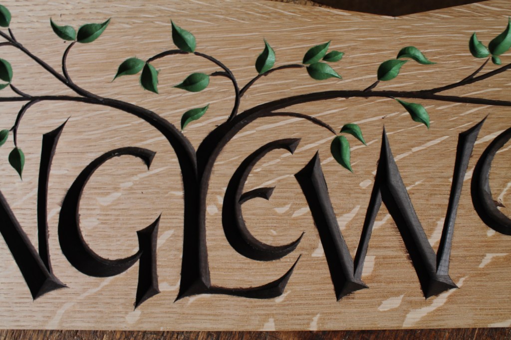
The painting was painstaking, and I did a couple coats on everything. However, I found in my experiments that I could go over the edges slightly (see the photo above) here and there and clean up in the next step.
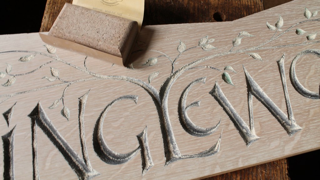
After all of the paint had dried thoroughly, I sanded the smooth surface of the sign with a flat cork sanding block and fresh 400 paper. Looks like a lot of dust, but it was actually a very light sanding.

There it is after vacuuming the dust and wiping down with a rag. Crisp edges as if I had that sort of painting skill and control.

I sighed in relief that the colors turned out the way I had hoped, and then it was on to the cap.

I wanted rain falling on the cap boards to drain mainly toward the back of the sign, so I cut and planed a bevel to the two top surfaces of the main body of the sign. That meant the joint between the two cap boards would be a compound miter. After marking, sawing, test fitting, and block-plane-tweaking, I got the fit and wondered how.
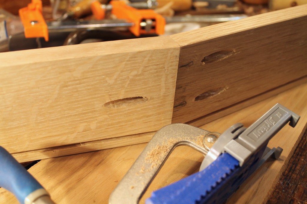
Wanting to join the cap boards to each other tightly and securely, rather than just to the sign body, I dusted off my simple pocket screw jig. With some Titebond III to seal the joint, three screws held the joint tight. The angle of these cap boards actually worked out perfectly with the angle of the pocket screws.

Strong enough for the purpose, for sure. I plugged all of the pocket screw holes, and two of the three are hidden by the sign body.

There’s the cap held in place with stainless steel screws that can be removed if needed for maintenance.

There it is after treatment with Watco Exterior Oil — Natural. The oil and solvents have no effect on the paint. I opted against exterior varnish and for the oil that can be more easily maintained with another application anytime. The white oak itself is naturally decay resistant.

The ray fleck comes out more at certain angles to the light. That groove I plowed under the front edge is meant to force any water that wraps around that edge to drip off before making it to the body of the sign itself. Can’t hurt, I guess. The finished sign with cap boards is 35 1/2″ long and weighs a little over 10 pounds.
All ready for the “Minglewood” retreat that I suppose is ideal for anyone “born in a desert and raised in a lion’s den.” (A comment on the previous post spurred me to take a closer looks at the lyrics of New Minglewood Blues.)
I’ve got other projects underway. One that’s been ongoing, and has taken a lot of time and work, is the development of the plans and tutorial for building my new bowl horse design. Without Jeff Lefkowitz‘s genius and hard work, I don’t think I’d have ever been done. But they’re finished! Now I just need to sort out some more technical computer details and I hope to make them available by the end of the weekend. So, more on that soon I hope.
And…

Eventually, I’m going to find the time to get to these hickory posts and rungs I shaved down months ago. I’ve bundled them now with Superman duct tape to grab my attention. It’s been a few years since I’ve made a JA chair, but I’ve got my new version of the MACFAT book, and I’m excited to see that Peter Follansbee just put out a video series on making the JA chair. Who better? So, with all that help, I’ll sort it out.

Your work is awesome! Sue
LikeLiked by 1 person
Very beautiful. What clean and neat lines!!!
LikeLiked by 1 person
Exceptional in every way. The color looks great. I just had Chris Pye’s book out the other day and he sanded one of his projects with an orbital sander! 😉
LikeLike
Thanks, Peter. I’ve learned a ton from Chris’ books over the years. A true master.
LikeLike
Thanks, Fergus. This white oak is quite hard, so it cuts so crisply and leaves clean unbruised edges. Much like your preferred material of stone, I think!
LikeLike
Beautiful work! I do enjoy reading your blogs. Fascinating seeing the processes you go through. Prompted me to buy Martin Wenham’s book too!
LikeLiked by 1 person
Dave,
It looks terrific! All the forethought that goes into your work is displayed with this sign. I’m sure the Minglewood sign will be appreciated for a long time to come.
LikeLiked by 1 person
Thanks, Skip. I’m a chronic over thinker, but it occasionally has advantages.
LikeLike
Thank you, Kaya.
You’ll love Martin’s book. It is infused with his enthusiasm and experienced advice.
LikeLiked by 1 person
Beautifully done! The owners should love it.
Good choice on the oil too. My luck with oak and certain varnishes has it oxidizing and creating black streaks over time. The oil should solve that.
LikeLiked by 1 person
Thanks for sharing that experience, Bob. Good to keep in mind.
LikeLike
Very beautiful. Thank you.
Perfect timing for the bowl horse plan. Thank you in advance. You have been an inspiration to me in these trying times.
Martha
LikeLiked by 1 person
That’s very kind of you, Martha. Thank you.
I appreciate your interest in the plans as well!
LikeLike
Beautiful design Dave. Love the style and flow of the letters. Question…what is the width of the thinner legs, as in the M and N?
LikeLiked by 1 person
Thanks, Gene.
The thinnest parts of those narrower elements are about 1/4″ wide, maybe a hair under.
LikeLike
Thanks for getting back to me. I picked up Martin Wenham’s book…thanks for the recommendation, a valueable resource, easy to follow. During his layout he draws a scoring cut down the center of the letter. I just finished a black walnut bowl that I carved a saying in the rim. The capitals were over 1″ high but I found it next to impossible to draw and stab lines in the thinner legs. I noticed in your letter carving video you didn’t bother with those score lines, possibly because it was bass wood and not needed? I was concerned about “lifting” up the wood without making the stab cut. What do you think?
LikeLike
Your concern is warranted to some extent, Gene. In fact, that is the essential reason for making those stab cuts down the center of a letter. It serves as a stop cut and is, therefore, more important for elements that are running perpendicular to the grain of the wood. But, in reality, the actual risk depends on how the particular piece of wood is behaving, how thick the knife or chisel blade is, etc. So, in cooperative wood with a thin knife blade and good technique, you can get away with it.
And there are other ways to, in-effect, make these stop cuts. In the case of this carving in white oak, I used the v-tool to accomplish the same while also removing a large amount of the waste. Even through the thinnest elements.
LikeLike
Thanks for your feedback. I’m using different tools for making the letters…chisels, gouges and chip carving knives. I’m going to see if I can work with a penknife.
Thanks again.
Hope you’re well.
LikeLike
Really beautiful, such a joy to read your posts
LikeLiked by 1 person
Thank you, Martha!
LikeLike
Beautiful, crisp execution of all carvings, even in “coarser” grained woods…what tools do you use to carve the leaves on your alphabet and mingle wood masterpieces?
LikeLiked by 1 person
Thanks, Regis.
I carve the smaller leaves in softer woods like basswood and butternut with the pen blade of my pocket knife (like on the alphabet boards).
For these larger leaves in this white oak, I used a couple gouges of different sweeps (maybe a #5 and a #7?) ground to a bullnose, or cambered, front edge (like a fingernail) that allows the edge to reach the bottom without the corners digging in. each leaf has its own shape and relation to the grain direction, so that must be adjusted to individually. I’ll try to do a post specifically about leaves sometime.
LikeLike
David Apprapo color theory. In case you were not aware… Yale has put out an interactive computer version of Joseph Albers, Interaction of Color. It’s really fascinating.
Also David Hornung wrote a book on Color that is proving to be useful. Well organized and enlightening. It’s basically a course on color theory.
I too am enamored with the subject and have delved into the subject this past winter.
I enjoy your blog very much. So thoughtful. Thanks for sharing your insights as you do.
Happy studying! Happy Carving! Keep on! Michelle Marguerite
LikeLike
Thanks for sharing those resources, Michelle. I was unaware of them. I found the Yale site since reading your comment. Here is the link if others would like to explore: https://interactionofcolor.com/ I haven’t had a chance to actually enter the site yet, and I don’t know how much it costs.
LikeLike
Stunning!
LikeLiked by 1 person
Thanks Dave for a great read and always sharing the links to products that others may want to try. Your blog is so inspirational and your creations are always one of a kind. I have been looking for some acrylic paint and this may be the trick. Please keep inspiring us.
LikeLiked by 1 person
Hi Dave,
When you painted the leaves, did you use two different shades of green to give it the shadow look/effect on one half or is it the same color for the whole leaf and the contour of your carving naturally adds that effect?
Needless to say this piece is beautiful and I sincerely appreciate your attention to detail in the process writeup. It has helped me improve methods and outcomes in my own work and I thank you for that.
Chris
LikeLiked by 1 person
You’re very welcome Chris. Thanks for taking the time to let me know.
Just one shade of green for the leaves. As you suspected, the perceived variations are just the result of the wonderful effect the light has on the v-profile of the carving.
LikeLike