
I do have some bowls in process to share before long, but some photos from a couple recent lettering projects first. I find myself adapting my tools and techniques according to the wood and the size and style of the lettering. I learn something from every new opportunity.
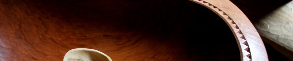
The top photo shows part of a large butternut board that will be framed in walnut by a cabinet maker for a sizeable display case for an electric train collection. Actually, there will be two display cases as you can see from the two full-view photos below. I was provided with some general guidelines such as including the logos/symbols and what the text should say. Beyond that, I was given the freedom to explore.


The boards were 50″ x 7″. To allow for the frame, the letters ended up at about 4 inches high. So this was not a lap-and-penknife project. The L logo represents Lionel.

The Steelmark logo goes back long before the Pittsburgh Steelers adapted and adopted it.

After much thought and sketching in various sizes, eventually it’s on to the board. I can really burn through an eraser, but time spent in this stage is important for a project like this. Got to calm that itchy carving finger.

I should mention that before the drawing took place, I put a final surface on the face of the board with a finely-set hand plane. I could have sanded the surface, but it’s nice to avoid the grit that remains embedded in the wood, waiting to dull the edges of carving tools.

It’s convenient to have access to the board from either side. My workbench is attached to the wall, so I gave myself full access by holding the board cantilevered beyond the workbench, held firmly with holdfasts. You can also see in the photo the main tools used. A couple v-tools on the right to excavate much of the bulk, and a couple knives. The larger knife to the top left is reground from a Garrett Wade marking knife I’ve had around for years. The three successive shots in the slideshow below show me using it to pare a side of the stem of the letter T.

In some areas, gouges are a help. A penknife blade is still handy, even in letters this large for tidying….

and for tighter curves like these numbers.

Similar techniques were used for this sign done a few weeks ago, except the overall style is a little more loose and the surface of the board was textured with a gouge before carving the lettering. The photo is a little blurry on the left side, but you can see the texture more clearly on the right. This is my second go with the same William Morris quote. The first one is here.
Next post should be some spoons with much smaller lettering.

you’re a genius at this. It’s beautiful stuff–
LikeLiked by 1 person
Awesome, Dave! Do the remaining pencil lines erase fully when done, or are you carving past the lines?
LikeLike
I find I can get the pencil lines off pretty much completely after the carving is done, Eric. Same with lettering on spoon handles and all that. I make sure I don’t press hard when sketching out the lines, otherwise the wood can be indented — which doesn’t erase. Sometimes I’ll use a kneaded eraser, but usually I find a Pentel High-polymer eraser works best. Those erasers are totally abrasive-free, so there’s no harm to the wood at all and you can rub like a maniac. With lighter woods, it doesn’t hurt to be a little more easy-going with the pencil.
LikeLike
Mr Fisher, or Dave if I may be so bold, I can’t put it off any longer. I have to say how much I enjoy your style of work – the bowl work, the lettering, the texture, the “slowness” (I mean that in a good way), pretty much everything. I have just binge watched all your videos over on finewoodworking and was captivated from start to finish.
Your skill level in your trade is only exceeded by your generosity in sharing your secrets (and this fantastic blog) with us all and your teaching skills are some of the best I have seen. So, thank you.
I would dearly love to start carving a bowl but the “great adze shortage of 2015” which is now rolling into ’18 is hindering me somewhat. I will get there one day though and in the meantime I will employ other methods to remove the bulk before turning to the gouge.
I would also love to have access to some of that Cherry but I’m pretty sure it doesn’t grow here in New Zealand.
LikeLike
Thanks very much for the kind words, Steve. Glad you’ve enjoyed the videos and I hope you find an adze soon. It’s good that you’ll find a way in the meantime; best wishes for your carving. I’m sure New Zealand has some wonderful carving woods. There is quite a carving tradition among the Maori there. Wonderful stuff.
LikeLike
Dave,
Stunning work! I really hope Fine Woodworking does a Video Series on your carving style/techniques. I am enjoying your Bowl Carving Series there.
Mahalo
Earl
LikeLike
Thanks, Earl. Na’u ka hau’oli
LikeLike
Two gouges and a couple of little knives, the workpiece hanging off the edge of the bench. Amazing work. The curved, tapered ends of some of those letters are so crisp – hard to do without serifs.
Thanks for the inspiration.
LikeLiked by 3 people
Beautiful and impressive!
Impressive because of using only a v-gouge and a couple of knives. My ever-expanding collection of carving gouges is becoming envious.
LikeLiked by 3 people
My thought exactly!
LikeLike
Bob and StJohn (the quiet workshop) have already expressed what I had hoped to, and their words are more eloquent than mine. You are an inspiration.
LikeLiked by 1 person
Nancy, Bob, and StJohn, thanks very much. It is nice to use as few tools as possible, but I still used a few gouges in some spots on these projects, mainly on the tighter curves of some of the larger letters. I’d still like to experiment with some knives to work in there smoothly without chatter, but a few gouges can be very useful — or a lot if one wishes!
LikeLike
Bowls, spoons, lettering and teaching. All inspirational, admired and remembered by many and yet you seem to stay humble and committed to your roots. Perhaps the most admirable trait of all. After needing to decide between Greenwood Fest or Fine Woodworking Live it was determined I’ll have to learn what I can from you in Sturbridge this year. I am really looking forward to soaking up all I can for application toward my upcoming self employment making saw dust and shavings.
LikeLike
Looking forward to talking with you in the Spring, Scott!
LikeLike
Wonderful, David. The flowing text in both “TRAINS” letterings fits the subject perfectly, makes me want to get on a road and see something.
LikeLiked by 1 person
Beautiful work, Dave–the way the light catches that lettering is really fantastic.
LikeLiked by 1 person
Very crisp 🙂 I really like the textured surface, it reminds me of the gorgeous Japanese-style adzed table tops produced by Robert Thompson furniture:http://www.robertthompsons.co.uk/ (“mouseman furniture”).
You mention butternut and box elder elsewhere – neither woods I’ve come across in England – , which other woods would you consider using, or avoid, for such work? Walnut & cherry presumably good. How about oak, ash, sycamore, sweet/horse chestnut, poplar,…?
LikeLike
You can carve lettering in any wood. You just have to adjust your technique accordingly. I may be able to carve very large letters in white pine with nothing more than a knife. The same letters in white oak will require some roughing with chisel and mallet, followed by some paring with gouges, knife, etc.
LikeLike